Color is one of the most powerful tools in a filmmaker’s toolkit. It shapes the emotional and visual tone of a scene, guiding the audience’s emotions and enhancing the storytelling process. As a filmmaker, understanding color theory can elevate your film’s aesthetic, making it more engaging and visually striking. In this article, we’ll delve into color theory for filmmakers, exploring how you can use it to captivate your audience and create lasting impressions.
What is Color Theory?
At its core, color theory refers to the guidelines and principles used to communicate with color. It’s about knowing how different hues interact, complement, or contrast with one another to evoke specific feelings. Color theory has been an essential part of artistic expression for centuries, and it’s no different in filmmaking.
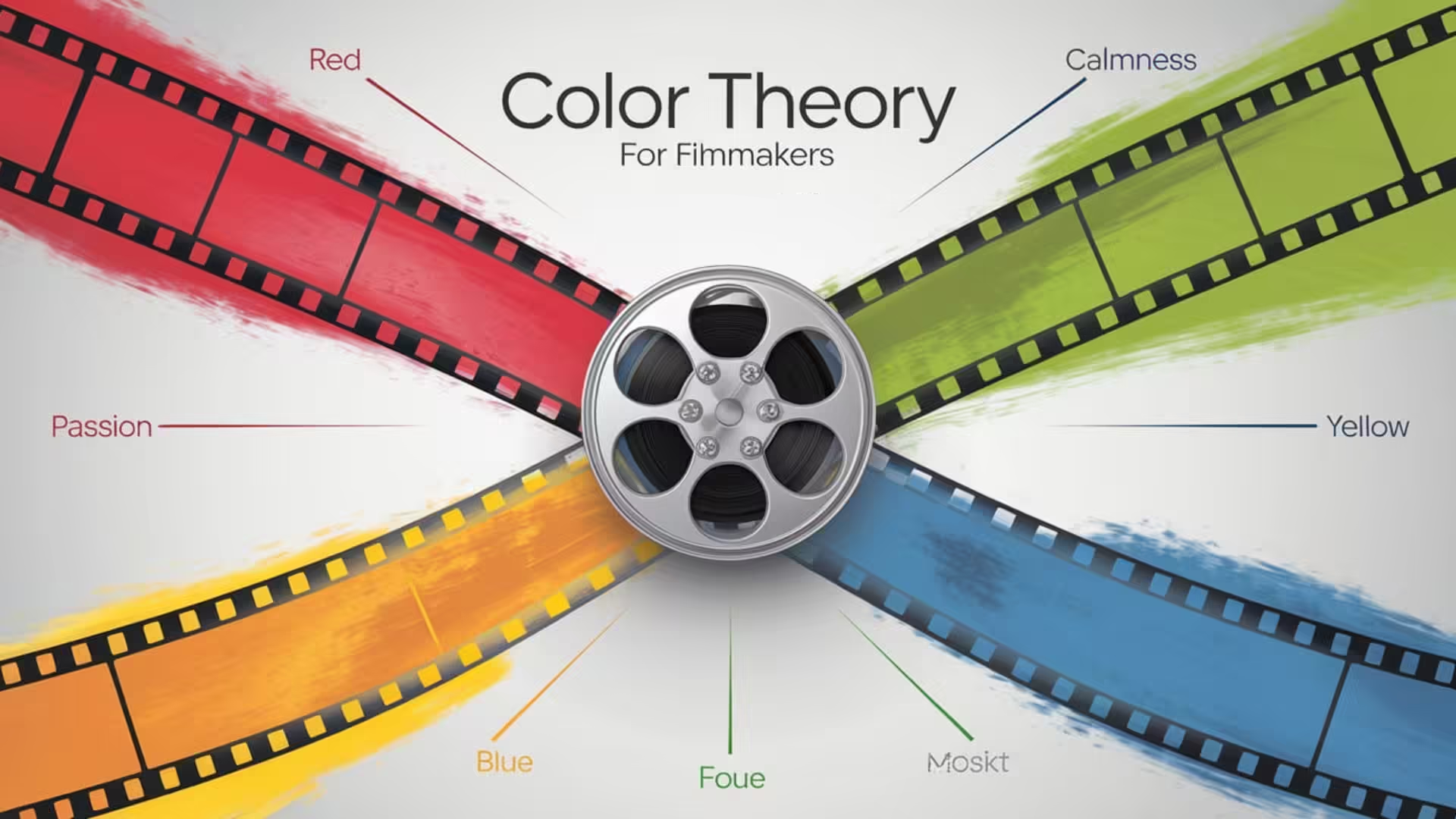
Colors have deep psychological impacts. For example, blue is often associated with calmness or sadness, while red evokes passion or danger. By understanding these associations, filmmakers can craft more emotionally resonant scenes.
Why is Color Theory Important for Filmmakers?
For filmmakers, color theory is not just about aesthetics—it’s about storytelling. A well-chosen color palette can:
- Enhance the Narrative: Colors can symbolize certain themes or emotions in a film. A character’s journey from darkness (blue) to enlightenment (yellow) can be visually depicted through the shift in color tones.
- Set the Mood: Color schemes can make a scene feel warm, cold, ominous, or nostalgic. Filmmakers can guide viewers’ emotional responses by manipulating colors.
- Create Visual Harmony: A cohesive color palette can make your film look more professional and polished.
- Communicate Subtly: Even when it’s not overt, color often works subconsciously, making viewers feel a certain way about a scene or character.
Essential Color Theory Concepts for Filmmakers
- Primary Colors
The foundation of color theory is built on the three primary colors: Red, Blue, and Yellow. Every other color is derived from combinations of these hues. - Color Wheel
The color wheel shows the relationship between colors. By understanding this tool, filmmakers can easily identify complementary, analogous, and contrasting colors, which can be used to enhance their scenes visually.
Example: In the movie Mad Max: Fury Road, the intense contrast between the scorching orange desert and the deep blue night sky creates a striking visual appeal. - Complementary Colors
These are colors that lie opposite each other on the color wheel (e.g., red and green, blue and orange). Using complementary colors in a scene creates a sense of balance and visual tension.
Example: In The Dark Knight, the contrast between the Joker’s purple suit and the yellow lighting adds a feeling of unease and danger. - Analogous Colors
These are colors that sit next to each other on the color wheel. They work harmoniously to create a serene, cohesive look.
Example: In Moonlight, the director uses a soft palette of analogous blues, purples, and pinks to create an intimate and emotional mood. - Triadic Colors
Triadic colors are evenly spaced around the color wheel, such as red, blue, and yellow. This scheme can create a vibrant and energetic visual style.
Example: In Amélie, the triadic scheme of green, red, and yellow adds a whimsical and playful atmosphere.
Using Color to Enhance Storytelling
1. Evoking Emotion with Color
Colors can evoke a wide range of emotions. For example:
- Red: Passion, violence, love, anger
- Blue: Calmness, melancholy, trust, isolation
- Green: Nature, envy, tranquility
- Yellow: Happiness, anxiety, caution
In Stanley Kubrick’s The Shining, the use of a warm yet unsettling red and gold color scheme throughout the Overlook Hotel heightens the tension and madness that unfolds.
2. Establishing Character Arcs
Color can also be used to reflect the development of a character over time. In Breaking Bad, the color palette shifts as Walter White’s moral compass changes, from soft, neutral tones at the beginning to darker, more menacing colors as his descent into criminality progresses.
3. Building Worlds with Color Palettes
A film’s color palette can also define its entire world. Directors like Wes Anderson are famous for their use of distinct color schemes to create whimsical, eccentric worlds. His use of pastel hues in The Grand Budapest Hotel transports viewers to an almost dreamlike, nostalgic version of reality.
Famous Films with Iconic Color Use
- Schindler’s List (1993) – Spielberg’s black-and-white film is punctuated with the iconic red coat, symbolizing innocence amidst chaos.
- The Matrix (1999) – The green tint of the matrix creates a digital, artificial world, contrasting the real world’s muted, earthy tones.
- Her (2013) – The soft, pastel palette reflects the film’s themes of love and loneliness in a near-future setting.
Practical Tips for Filmmakers
- Plan Your Color Palette Early: Decide on a color palette during pre-production, and work closely with your production designer and costume department to ensure consistency.
- Consider Lighting: Lighting will significantly impact how colors appear on screen. Experiment with different lighting setups to get the desired mood and effect.
- Use Color Grading: In post-production, color grading allows filmmakers to fine-tune the look of their film. This step is crucial for ensuring that the color palette is consistent and that any visual cues tied to emotion or story come through clearly.
Internal Resources on FilmsnMinds
- To deepen your understanding of how color theory ties into visual storytelling, check out our article on Visual Storytelling Techniques for Filmmakers.
- For more on character arcs and development, read Crafting Compelling Characters: A Guide for Filmmakers.
External Resources
To further explore color theory, check out these external resources:
Conclusion
Color theory is more than just a technical aspect of filmmaking; it’s an essential tool for telling compelling stories. Whether you’re creating a dramatic thriller or a whimsical adventure, the way you use color will significantly impact your film’s tone, emotion, and memorability. As you develop your next project, think critically about the colors you choose, and use them not just to decorate your scenes but to enhance your narrative.
By mastering color theory, you’re one step closer to captivating your audience visually and emotionally.
Color theory for filmmakers Color palette in filmmaking Color psychology in film Film color schemes Using color in films Color grading in filmmaking Cinematic color theory How to use color theory in film Color in storytelling for film makers Best color palettes for films Impact of color in movie scenes Emotional effects of color in film Color grading tips for filmmakers Color symbolism in movies Filmmaking and color psychology Color theory basics for filmmakers Role of color in visual storytelling Famous films with strong color palettes Complementary colors in film Analogous colors for cinematic look Psychological effects of color in film Color design in cinematography

